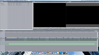


We began the film by looking at existing media texts to get some ideas for our shot types, CLICKING HERE will demonstrate this. In this we have chosen shot types that will fit our genre and have found specific shots that work well to draw the attention to both characters as there is no real definition as to who is the main character. We have mixed up the shots so the shots do not become boring and repetitive, we have used long shots to show the connection between the two character as they get closer and then have drawn the camera into their faces so the audience can see the emotion, this is typical for romance films to draw the audience in so it is clear that a relationship is growing. In our film we tried to capture the connection the characters have when they cross each others paths so we slowed the shots down to 50 percent. This technique demonstrates, to the audience, the idea of time literally slowing down and reinforces the romance.
When looking at shot types the key with them is to either withhold or release information to the audience. The shot types below show the key shots that show how information is released to keep the audience in suspense. The key is to not give to much away, the first shot is of the girls face but not showing any emotion this allows for the audience to notice that she is a woman but not to what she is doing. The next two shots is of the moment that both of the characters meet, in these shots lots of information is released showing that there is an immediate connection between the too people.


We have really challenged the conventions of our genre in the dream parts of the short film. Each character has a dream about how their relationship could unfold and what it could be. None of the films we looked at took this approach, in most of the films the people are already in a relationship or the storyline is working up to them being in a relationship. The twist on our films adds to the magic of the love between the two characters, as you can see in the screen shots the dream side of the films fits very well with the romance genre.
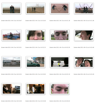
In our first film we decided to film in two parts; a dream world and a reality world. We knew we wanted to stick with a dream element to our film as it draws the audience in and does not have to necessarily make sense or follow a specific route all it had to be is relevant to the subject. With the dream aspect incorporated into our short film the audience can take a break from wondering what is happening to get a clean understanding that these two people have a connection.
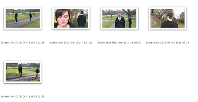
In the following few shots you see the couple return to reality and begin to wonder if they should stop and make something of what they have just imagined.
We wanted to generate a feeling of hope in the audience. It is typical in the genre we are targeting and the audience thrive off this. When the female character turns to look at the male character you can clearly see he is hesitant on whether to turn just in case she doesn't feel the same way. Finally he turns and the audience feel that something will happen between the couple but then are quickly shown the shot of the female character giving up and carrying on with her journey.
Ancillary Tasks
For our ancillary tasks I feel we met the codes and conventions of well known posters but also tried to use the theme of a very British standard film.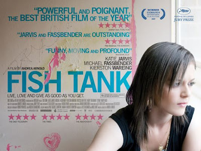
When looking at existing media such as the film poster for a British made film "Fish Tank" you can see that the fonts are clear and bold so as to make the poster look very appealing, the guerrilla style to the film is also related in the poster this keeps in with the theme of the film. We took this into consideration when producing our film poster but also wanted to add a Hollywood style blockbuster film poster to fit our genre of romance, we looked at existing posters earlier on in our research, Ancillary task research, here you can see other film posters we have related our work to.


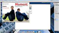
 When producing this film review we looked at an existing film review magazine and took inspiration from them, the straight clean cut edges of all of our paragraphs make the review look very professional. We used the same colours in our poster so the brand is recognised and also the LOGO of our production.
 Our film poster follows the conventional themes of our genre, the colours and text have been made to draw your eye in and focus on the emotion between the two characters. Our title is produced in Bold and in a bright colour so it stands out from the background, the poster really relates to independent film poster as we thought this would be most relevant.